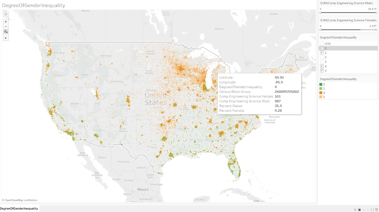
We’ve all heard about the many improvements and changes being made to help get women into Hi-Tech and the Sciences, but where are these improvements being seen? Is the entire nation reaching gender equality or are there pockets of improvement and pockets of stagnation. These are the questions I set out to answer using the Safe Graph US Census Bureau Census Block Group American Community Survey Data from Kaggle.
This census data is an extremely comprehensive dataset at the census block group level (on the order of 1500 households each) containing detailed information on a multitude of demographic aspects of the people living in the US. However, the data is quite sizable and comes in the form of a very large zip file that makes the data hard to explore. Moreover, the zip file contains many internal files containing different demographic topics, each with its own schema. I used Pivot Billions to preprocess my data for Tableau due to its data ETL and joining features.
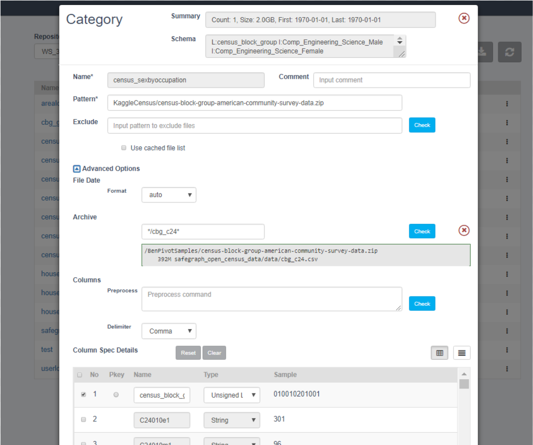
Using it, I quickly extracted the key columns I wanted from the various internal files in the census data while the data was still zipped and in S3.
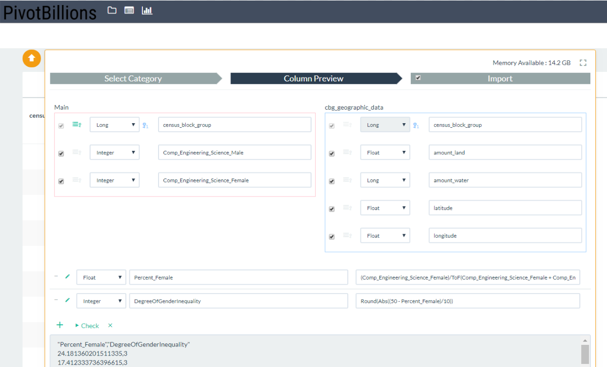
Then I joined those key columns together by census block group and enhanced the data with a few custom columns such as the percentage of women and the degree of gender inequality.
This second custom column is used to describe how far away from equal (50% men, 50% women) the computer, engineering, and science workers are in each census block group. The values range from 0 to 5 with 5 meaning highly biased towards one gender. Now that the main data I was interested in was ready and loaded into Pivot Billions, I then downloaded the Pivot Billions preprocessed data as a csv file and then simply imported the data into Tableau as a text file.
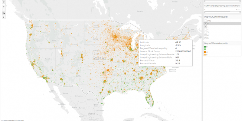
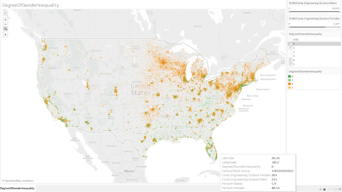
Now all I had to do to explore the distribution of gender equality and inequality in the United States was to visualize this data. I quickly opened a new worksheet and told Tableau to treat the Census Block, latitude/longitude, and DegreeOfGenderInqeuality fields as Dimensions (categories). Then I added some of the interesting fields to the displayed tooltip in Tableau and colored by DegreeOfGenderInequality. Focusing on the extremes of Equality (Green) and Inequality (Orange), I was left with a very telling interactive visualization.
It was immediately clear that the coastal regions of the US and the Southeastern US region consistently maintained a high level of gender equality. On the other hand, the North/NorthEastern US regions leaned heavily towards just one of the genders (typically towards men).
Though many areas of the US seem to be making strides towards gender equality in Hi-Tech and the Sciences, many still remain heavily biased and stagnant. It may be worthwhile to look at the regulations and companies operating in the coastal and southeastern regions of the US to see what policies (governmental or private) may be having an effect. With time hopefully these policies will be implemented across the US to equalize the representation of both genders in these fields and truly create a more equal society.
To interact with this visualization yourself, feel free to go through my Gender Equality and Inequality workbook on Tableau Public.

