Getting Started Primer
- Enter your Email Address and then click on the Sign Up button.

- A confirmation email will be sent to the Email Address provided in the sign-up form. If you do not see it in your Inbox, please check your Spam folder.
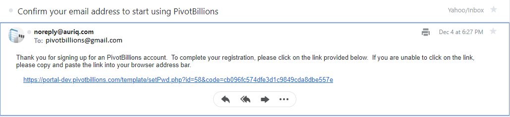
- Click on the confirmation link from the email.
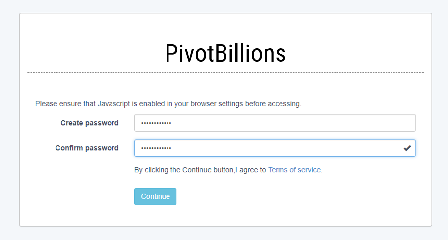
- Create and confirm a password for your account.
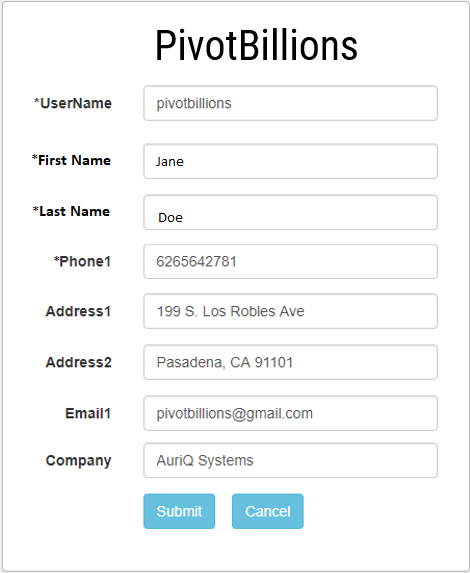
- Enter UserName, First Name, Last Name and Phone. Please make sure to remember your UserName as this will be necessary to sign in. Add any additional information for your account (optional).
- You should now be logged in to PivotBillions.
- Click on the plus symbol located in the upper right of the the data selection box to show data import options.
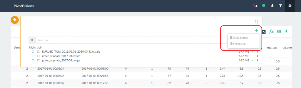
- The Drag & drop option lets you add files stored locally on your PC. The From URL option lets you specify files accessible online by entering one or more URLs into an input box.
- After you've added your new data files either from local storage or from an online source, you will see the new data files in the data selection box.
- From the Pivot Billions data selection box, select the Main data file you want to load from the selection list and then click on the Preview button.
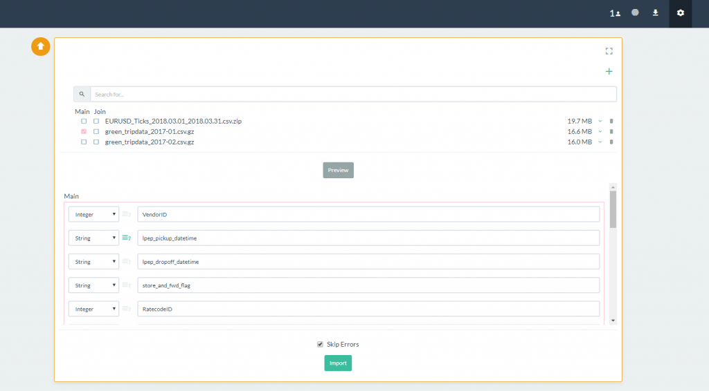
- A preview of the columns will load beneath. You can change the column labels or data type as well as select your data keys here.
- By default the Skip Errors option is selected. This instructs Pivot Billions to skip rows with errors in them. Click on the Import button to load the data.
- You should now see the report table with the selected sample data loaded.
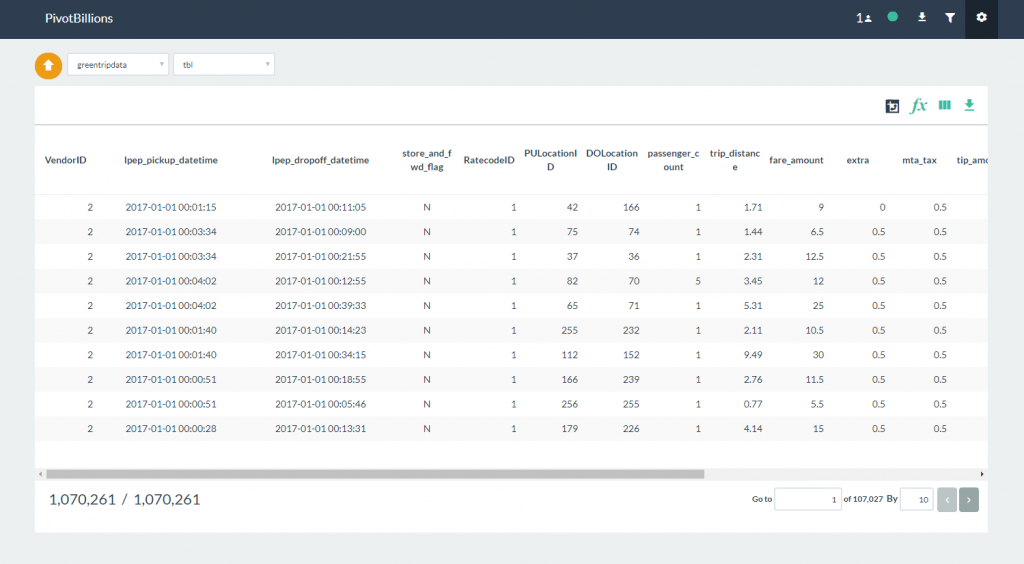
Once the sample data has been loaded, you can begin interacting and analyzing the data from the Report UI.
Sorting
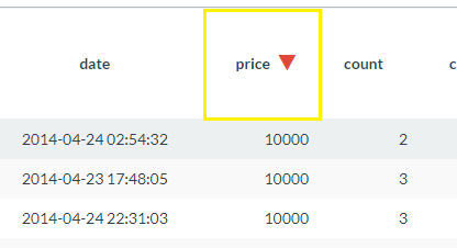
- Hover over a column name in the Report table and click on the Sort icon
 in the tools overlay.
 - The selected column will initially sort in descending order. Click the sort icon again to sort in ascending order. The sort direction will be displayed next to the column name as shown below.
- Hover over a column name in the Report table and click on the Filter icon
 in the tools overlay.
 - The Filter Condition box will open allowing you to enter the criteria for your filter. After inputting your filter criteria, click enter on your keyboard to implement.
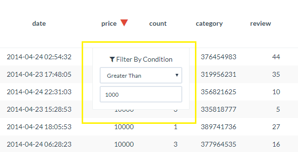 You can apply multiple filters across different data columns and within the same column (e.g. "Greater than 1" and "Less than 10")
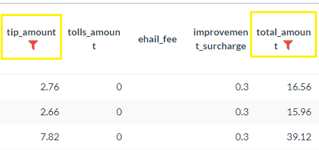
 - Filtered columns will display the filter symbol next to the column label.
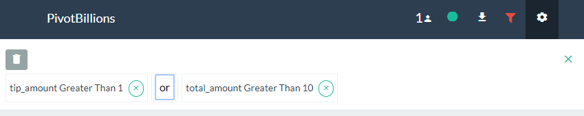
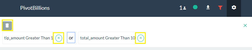
- To change the Logical operation of filters (AND, OR), click on the Filter icon located in the header of the UI then click on the "and" text between the filter conditions. This will toggle the logic from AND to OR.
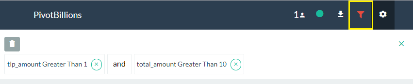
- To delete or remove a filter, click on the (x) next to the filter condition to remove a single filter, or click on the trash icon to remove all filters.
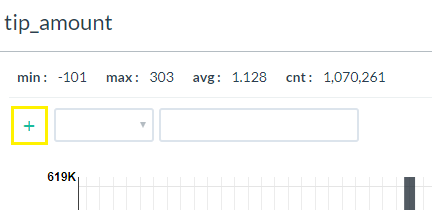
- Within a distribution graph or pivot table, click on the plus symbol (+) found usually at the top of the table, chart or graph.
- Use the dropdowns and fields that appear to enter your filter conditions.
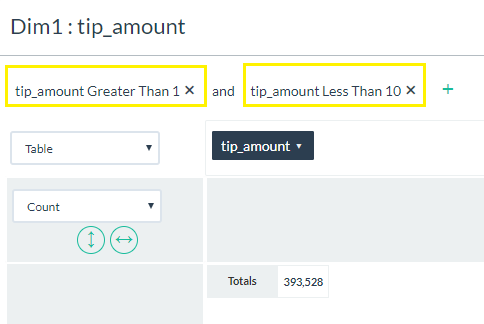
- Just like global filters, you can enter multiple local filters at the same time. In addition, you can click on the "and" text to change the logic to an "or" condition.
- To remove any local filters, simply click on the (x) next to the filter condition.
- Hover over a column name in the Report table and click on the Graph icon
 in the tools overlay.
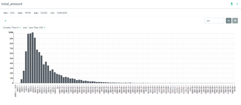
 - Directly beneath the Report table, a Distribution graph will be generated based on the column data selected. If the data is numeric, then the graph will show distribution of counts by range. If the data is string, then the counts for each unique value will be shown.
- Clicking on the Table icon
 will show the distribution data represented in table format.
 - For string data, clicking on the Pie Chart icon
 will show the distribution data as a pie chart.
Often times, the data you want to analyze might be split over multiple files. In order to analyze all the data as a cohesive data set, you must first combine the files. In Pivot Billions, you can combine data files that have the same schema or data structure by following these steps.
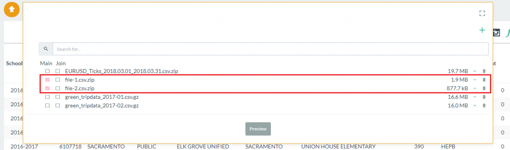
- From the data selection box, click on the check boxes for each file you want to combine under the Main heading. In this case we are using the two New York taxi data files already included with Pivot Billions.
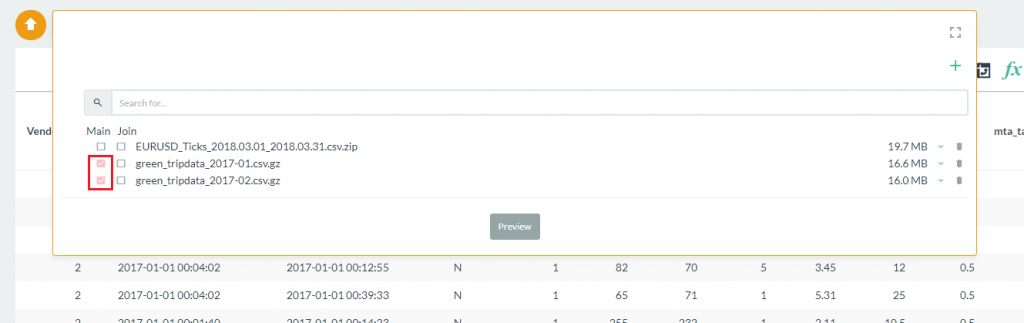
- Select the Preview button to view the column labels and data types and click Import when you are ready.
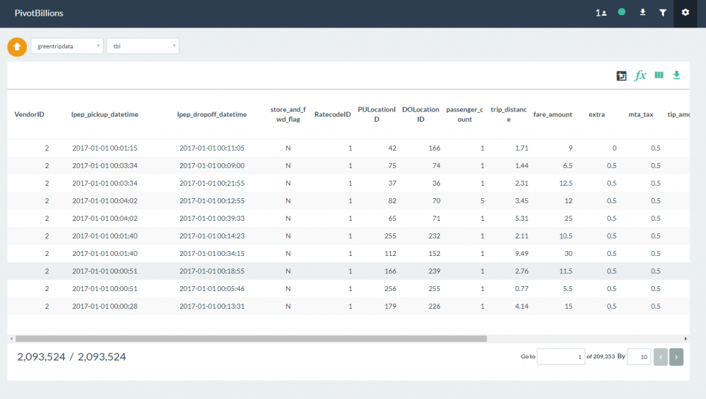
- The combined data files will be loaded into the report table. Notice that the combined row count is twice that of a single data file.
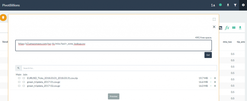
When you have different types of data files that are connected through common keys, Pivot Billions allows you to Join these files in a left join fashion. This is very useful if you want to integrate a lookup table to your primary data set. In the following example, we will combine the two sample New York taxi data files and then join the taxi zone lookup table file located here to the combined data set.
To Join data, follow these steps:
- Import the taxi zone lookup file by entering the URL in the data selection box. Click on the Go button to import the file.
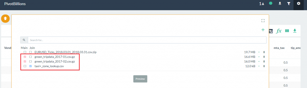
- Once the lookup file has loaded, click on the check boxes under the Main heading for the taxi data as shown, and then click on the check box under the Join heading for the taxi zone lookup file you just loaded.
- Select the Preview button to view the column labels and data types. Notice that there is a warning message above the schema preview that indicates there is no matching key column between the Main data set and the Join file. In the Main data set, there is a column labeled PULocationID while in the Join data set there is a column labeled LocationID.
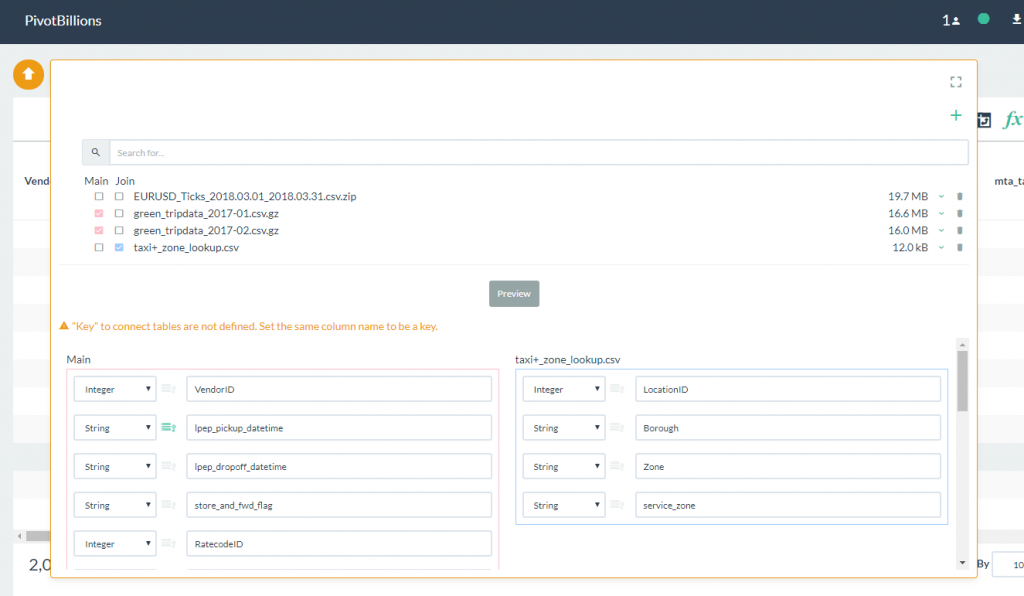
- Change the LocationID label in the Join data set to PULocationID as shown. Notice that the warning message disappears after a matching Key column has been identified.
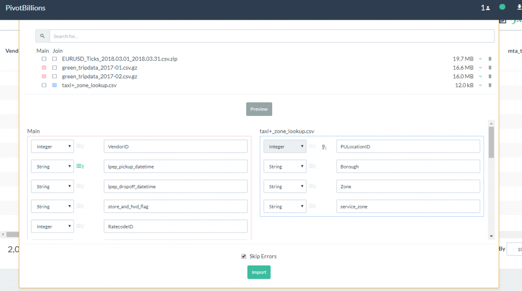
- Click on the Import button to load both the Main data set and the Join data set. Once it has loaded into the report table, slide right until you see the newly joined data columns of Borough, Zone and service_zone.
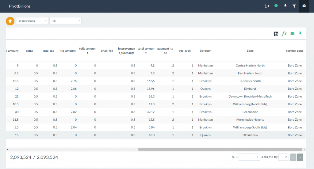
- At this point you can now select these columns as dimensions for analysis in pivot tables, as well as perform all other report functions. In this example we demonstrated joining one lookup table file, but you can Join multiple files as necessary following the same steps.