Overview
It should be apparent that we like to use data sets found in Kaggle. If you are not familiar with Kaggle, you should check out their website to peruse the thousands of great datasets available for free to play around with.
In this 5 Minute Analysis of the Kaggle Retail Data Analytics we explore historical sales data for 45 retail locations. In addition, we join two related supplementary data files to the main sales data file to dive into the relation between store type, fuel prices, and other indicators and how they might affect average weekly sales.
Steps
1. Load the Data and View its Structure
In this example, the steps for loading data is a little different from our previous posts because we are joining two supplementary data files to the main data set. The steps to follow are:
- Download and unzip the data onto your machine and access the Pivot Billions UI on your browser.
- Click the Add (+) icon from the data loader screen and select Drag & Drop.
- Drag your downloaded Features data set.csv, sales data-set.csv, and stores data-set.csv files to the Drag & Drop box in Pivot Billions.
- Select the left checkbox (Main) next to the sales data-set.csv file and the right checkbox (Join) next to the Features data set.csv file and the stores data-set.csv file.
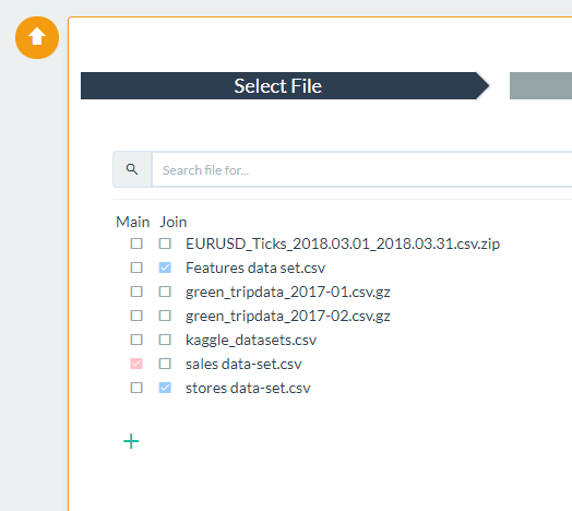
- Click Column Preview at the top of the screen. The resulting preview will show the column labels and data types for both the main dataset and the data we are joining to it.
- Pivot Billions automatically will find common keys between the data sets which are identified by the Key symbol next to column labels. You can modify keys here if you want, but for this example you can just use the ones selected as is.
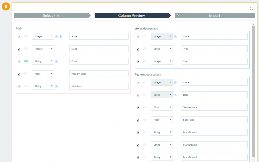
- Click Import at the top of the screen to load your data into the Report UI.
2. View and Explore the Data
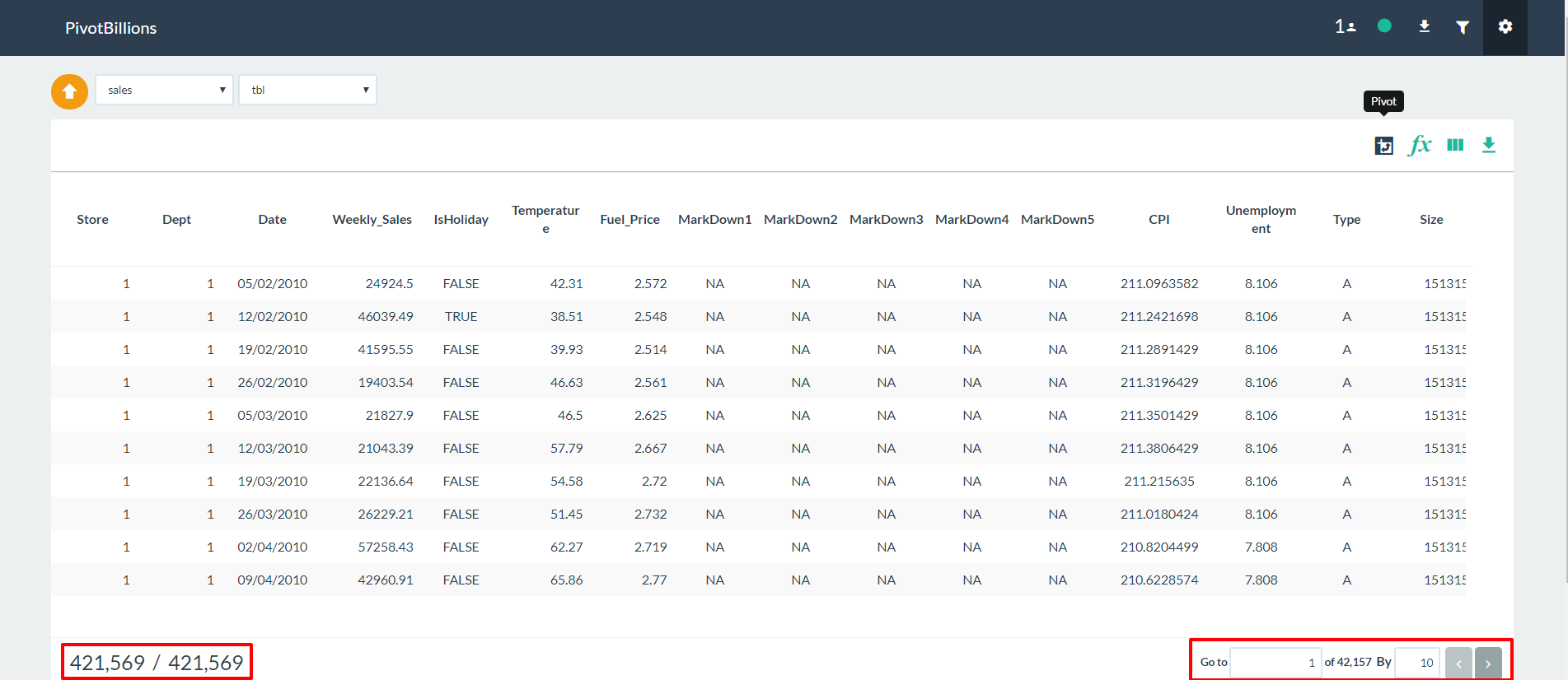
After the data has been imported, we can see a total of 421,569 rows. This contains the data and features from each of the three separate data files from our original dataset. We did some preliminary exploration by sorting data to find highs and lows as well as selected the Distribution option to see the distribution of data based on data column.
3. Pivot and Report the Data
Next we used the Pivot tool to do some quick analysis of a single dimension's relationship to total and average weekly sales. The basic steps are:
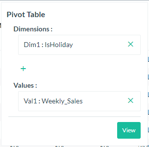
- Select and open the Pivot tool and then select a Dimension like IsHoliday or Temperature for the pivot table.
- Select Weekly Sales as our Value and click View.
- In the resulting table, select the Pivot View option and then drag and drop the dimension we want to analyze into the columns area.
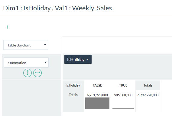
- Change the visualization to Table Barchart and then select the data Summation option to see the effect of the dimension on total Weekly Sales.
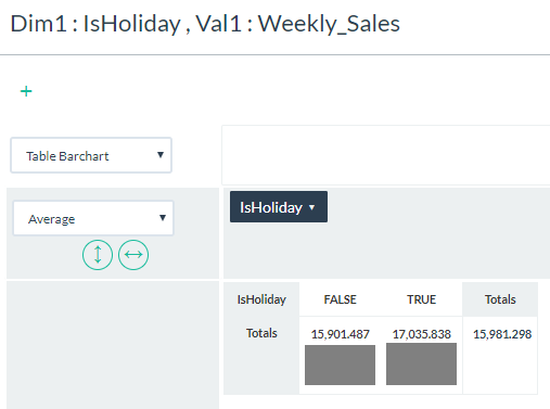
- Next change from Summation to Average to see effect on average Weekly Sales.
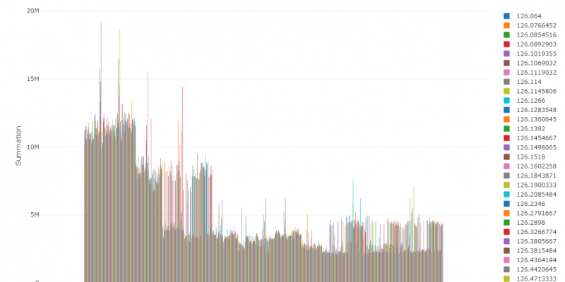
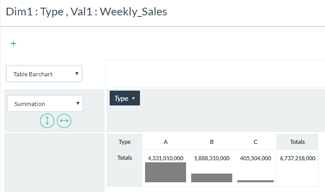
We did this same type of analysis for a few other dimensions which you can see below. We chose the Bar Chart visualization for these.
Store Type -Total
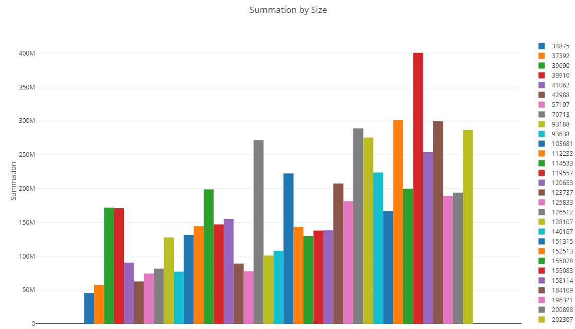
Store Size - Total
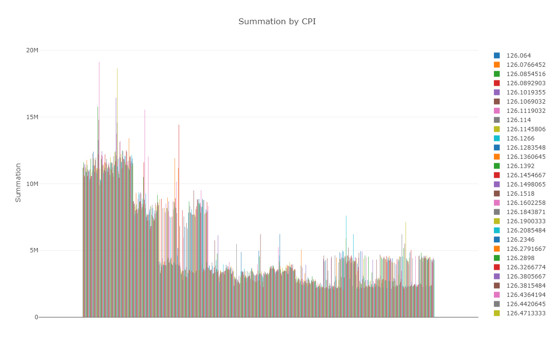
CPI - Total
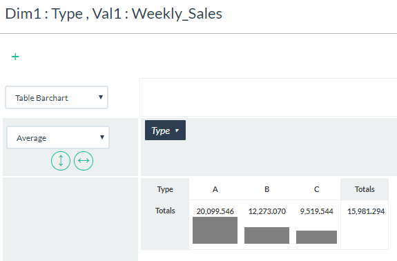
Store Type - Average
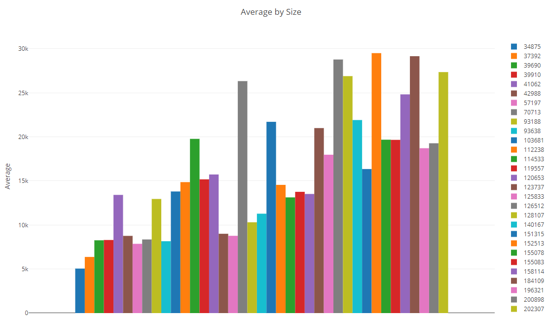
Store Size - Average
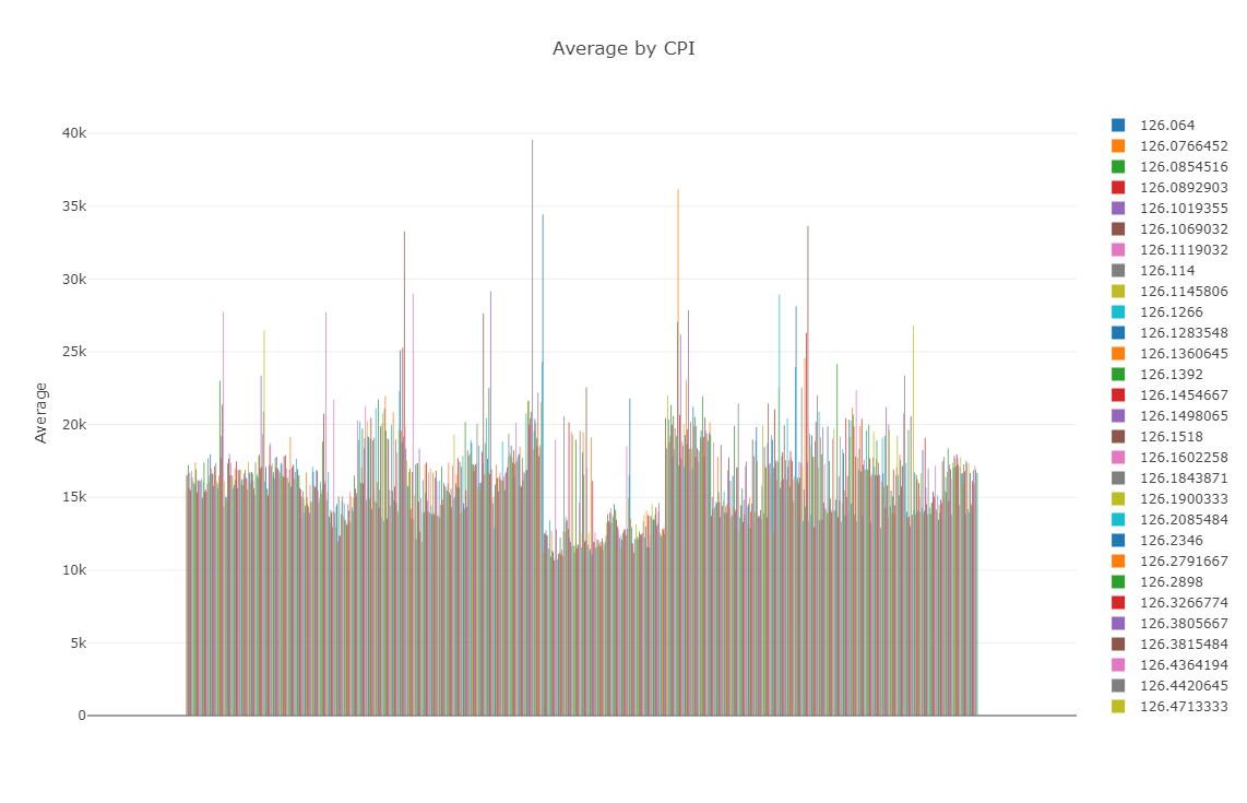
CPI - Average
The Wrap-up
We are able to see that the CPI (consumer price index) and the IsHoliday dimensions affect total sales but have less of an effect on average sales. The Store Type and Store Size, however, seem to have a stronger correlation to both the total and average weekly sales.
In five minutes, we were able to run these as well as similar pivot charts using Temperature and Unemployment dimensions. These last two did not show a very strong correlation to total or average weekly sales. The next steps if we wanted to dive deeper would be to try to use two or more dimensions and see how they might relate to sales behavior. It would be a good idea to set some filters to better manage the size of the analysis.

