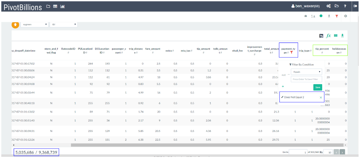
The holiday season brings with it a degree of cheer and joy that many claim makes people act friendlier towards each other. I wanted to see how this effect translates to action so I decided to look into tips for New York green taxis both during the holiday season and the rest of the year. To start, I streamed all of the green taxi data files from the public NYC Taxi and Limousine Commission Trip Record Data for 2017-07-01 to 2018-06-31 (the most recent year of green taxi data) into Pivot Billions and enhanced the data with two new columns: holidayseason and tip_percent.
There were many rows that weren’t relevant to this analysis since cash payments did not have records of tips, so I filtered out cash payments from the payment_type column in Pivot Billions bringing the total rows to ~5 Million.
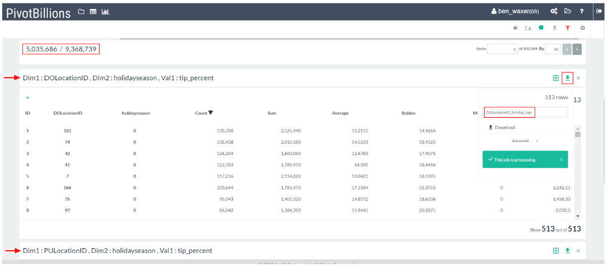
To dive into the data I made use of Pivot Billions’ pivot feature to quickly reorganize all of this filtered data by where the passenger(s) were dropped off (DOLocationID) and whether the trip occurred during the holiday season. My over 9 Million original rows of data were now shrunk down to a much more manageable 513 row detailed summary. Downloading this new view of the data from Pivot Billions I switched my focus to visualizing and analyzing the data in R.
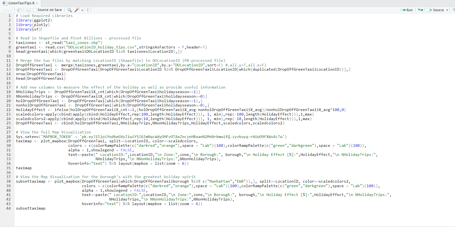
Now that the data was shrunk down to a size R can easily handle, I loaded the Taxi Zone Shapefile and my newly downloaded DoLocationID_holiday_tips.csv file into R. This was a simple process of uploading the shapefile from our datasource as well as our Pivot Billions - processed file onto my machine running R and then joining them by setting Location ID equal to DOLocationID.
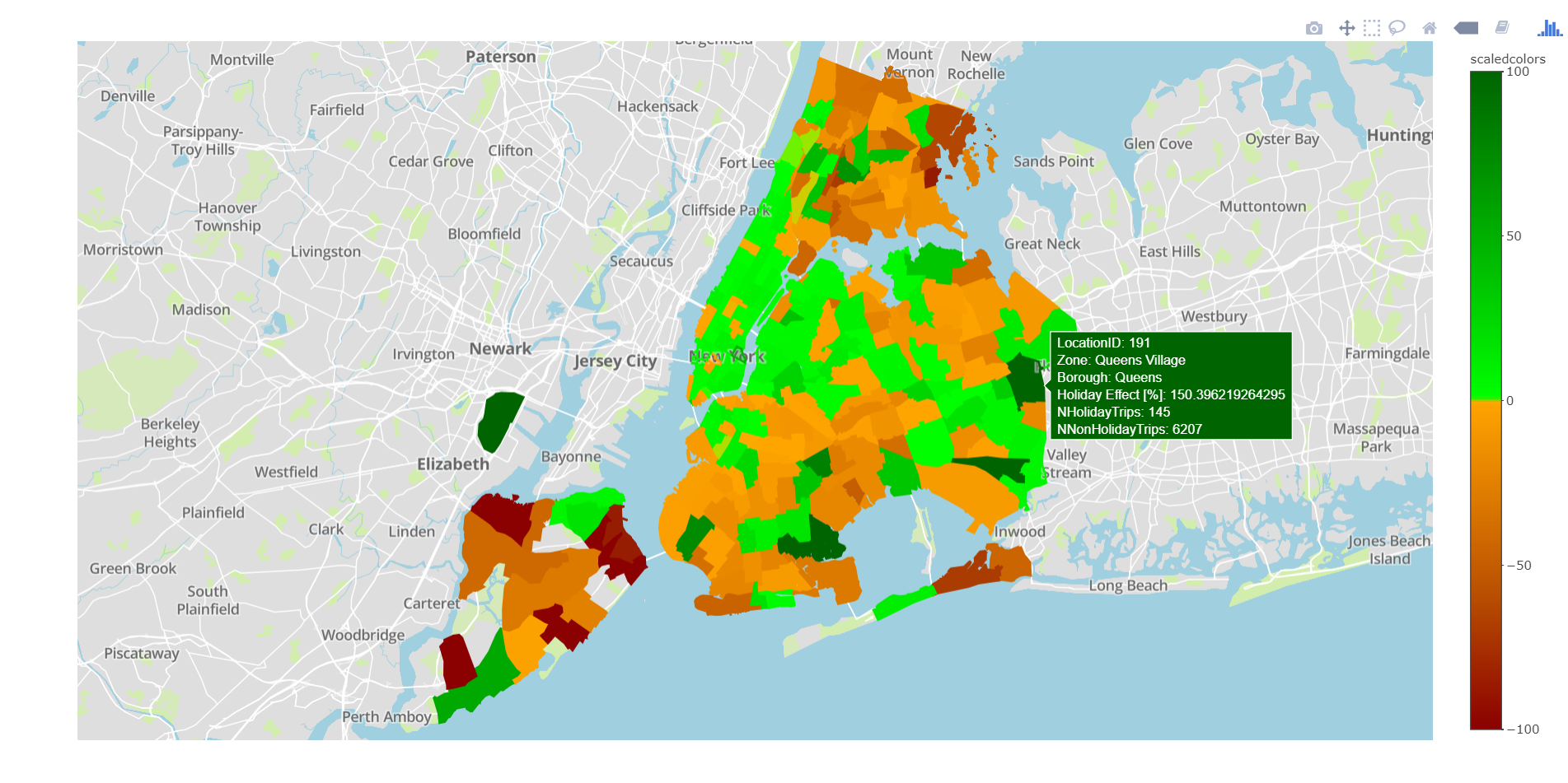
After quickly defining a new metric from our data called “Holiday Effect” that tracks the percentage difference in average tips between the holiday season and the rest of the year and adding additional information to the data to make it informative and explorable, I was left with a very clear and powerful visualization of the green taxi data.

It is immediately clear that there are regions with a much greater occurrence of positive holiday effects (green areas) than negative effects (orange areas) as well as the reverse. Utilizing R’s powerful indexing abilities it's easy to narrow down the data by location and explore which areas of New York experience the effect the most. It appears that Bronx and Brooklyn experience more negative effects whereas Queens is evenly spread between positive and negative. However, Manhattan and Newark Airport have a much higher proportion of positive effects due to the holiday season.
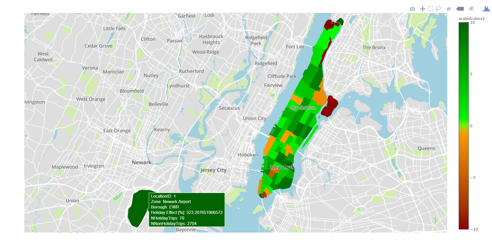
Though most of New York is being affected by the holidays for better or worse, people going to Manhattan and Newark Airport seem to be feeling the holiday spirit the most.
To create this visualization yourself you can download my R code, DOLocationID_holiday_tips.csv, and the Public Data’s Shapefile. You can also run this code replacing "DOLocationID_holiday_tips.csv" with "PULocationID_holiday_tips.csv" and DOLocationID with PULocationID to view the holiday effect on tips by Pick-Up Location.
