Pivot Billions Docker Instructions
Installation
- First install Docker onto your PC by following the instructions here.
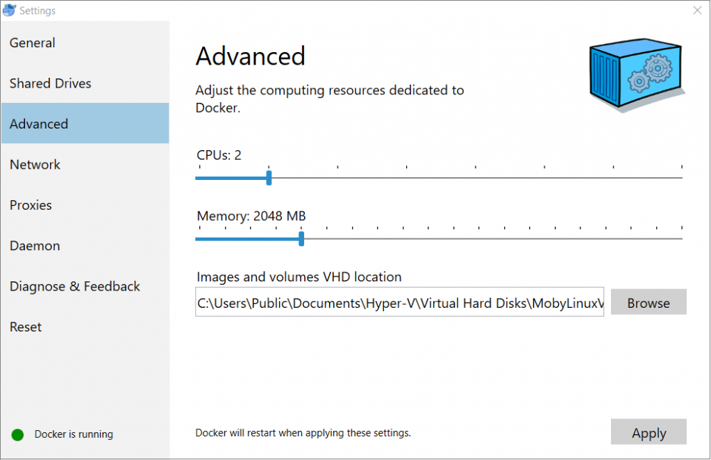
- Check your Docker settings to ensure that you have enough memory allocated to run Pivot Billions. (minimum 2 GB)
- Open a shell (for Windows 10 use Powershell or cmd.exe)
- Pull the Pivot Billions container from Docker:
>docker pull auriqsystems/pivotbillions
For docker on Windows, make sure to switch to Linux Containers in your settings, otherwise you will be unable to pull Pivot Billions.
- Run Pivot Billions
>docker run -dit -p 80:3000 --name="pb" auriqsystems/pivotbillions /bin/bash
>docker exec -d pb bash /home/start-server.sh
- Open a browser window and enter: http://localhost/index.html
- You should see the Pivot Billions UI in your browser
Analyzing Sample Data
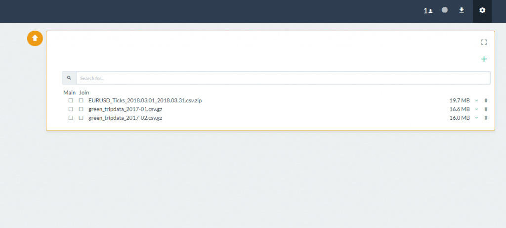
There are two sample data sets provided with Pivot Billions Docker version. One contains currency data and the other contain New York taxi data. To load either follow these steps:
- From the Pivot Billions data selection box, select the file you want to load from the selection list.
- For this example select the green_tripdata_2017-01.csv.gz file, and then click on the Preview button.
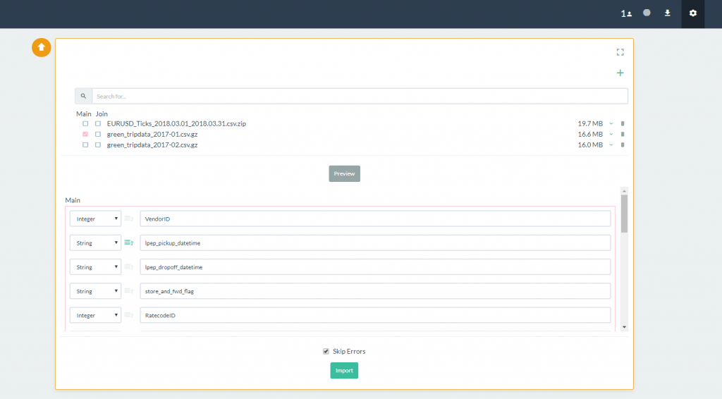
- A preview of the columns will load beneath. You can change the column labels or data type as well as select your data keys here.
- By default the Skip Errors option is selected. This instructs Pivot Billions to skip rows with errors in them. Click on the Import button to load the data.
- You should now see the report table with the selected sample data loaded.
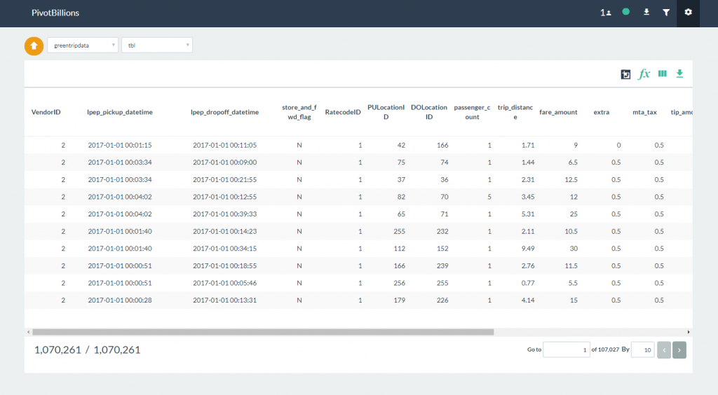
- Select the Column View Configuration icon and click on the Select None box.

- Click on the pickup_datetime, pickup_location_id, and trip_distance column labels and then click anywhere outside the configuration box.

Your table should now show only the three columns selected. - Click on the Add Column icon and enter the following:
Label: ymd
Format: string(s)
ESS Syntax: substr(pickup_datetime,0,10)
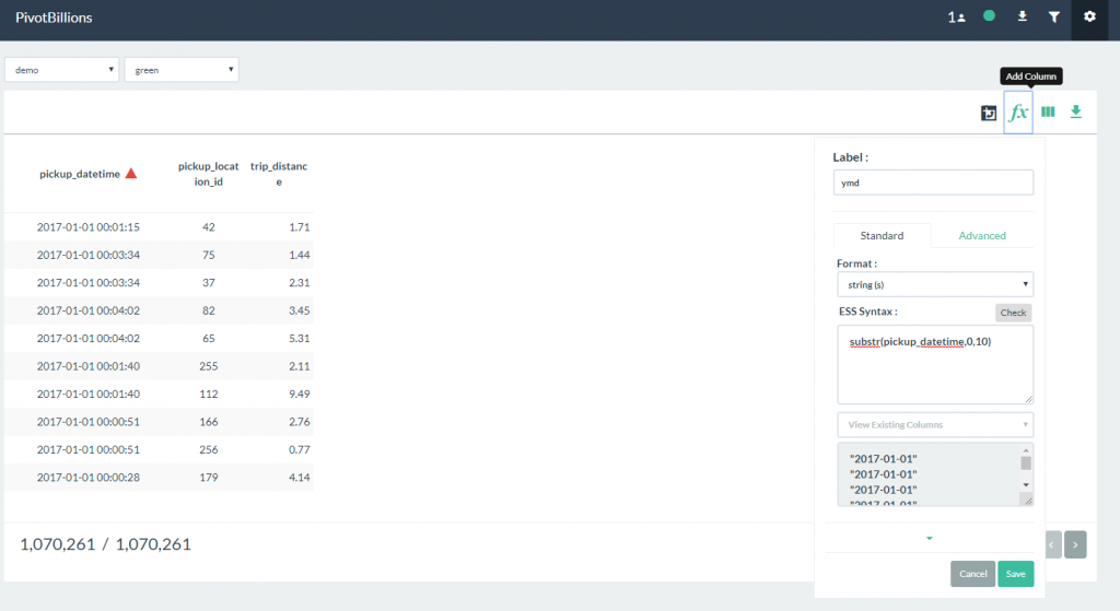
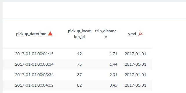
The settings shown above extracts the year-month-day from the original pickup_datetime column. For the purpose of our analysis, we don’t want to include the time information from the original column data. - Save the new column. Your table should now show four columns.
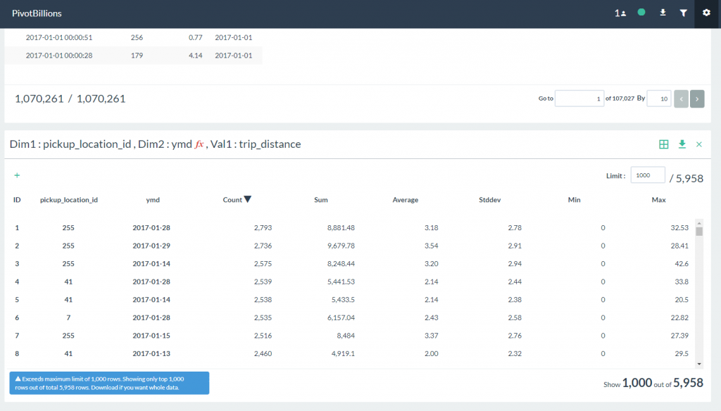
- Click on the Pivot icon and select pickup_location_id and ymd for your dimensions and select trip_distance for your value, then click View.

- A new table will be generated below with aggregated values for the selected dimensions.
- Click on the View Type icon to switch to Pivot View.

- Drag the pickup_location_id field label to the row area and then drag the ymd field to the columns area.

- Change the data value from Count to Summation.
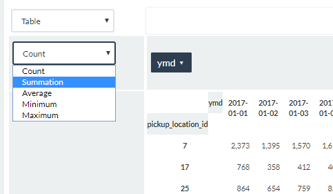
This changes the data value to the sum of all distances calculated for a pickup_location_id|ymd pair. - Sort the pivot table by largest total value by clicking on the up down arrow until you see the up arrow.
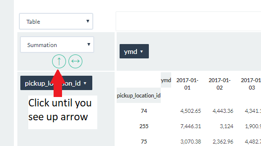
We see that the largest total trip_distances are associated with pickup_location_id’s of 74 and 255. - Click on the pickup_location_id field label to see a list of field values, and choose Select None to deselect all the values.
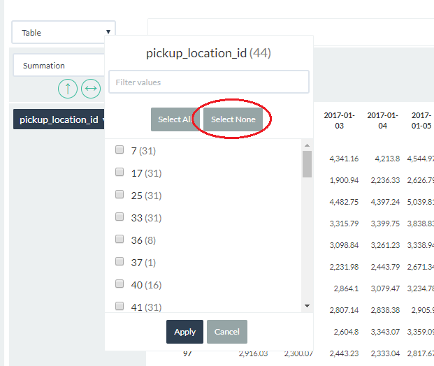
- Next individually select 74 and 255 and click Apply. Your pivot table should like like this:

- Click on the chart selection list and select the Line Chart option.
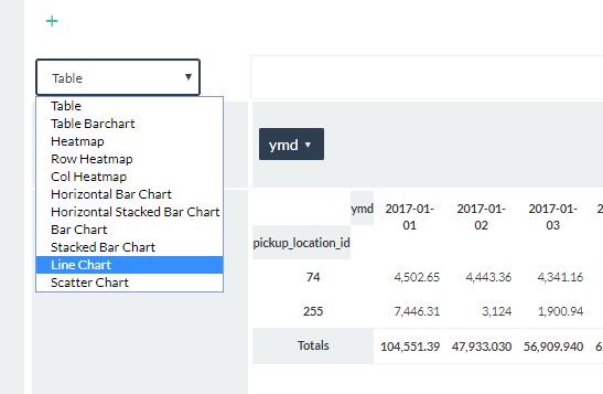
- You should now see a line chart of total trip distances logged per day for each pick up location id.
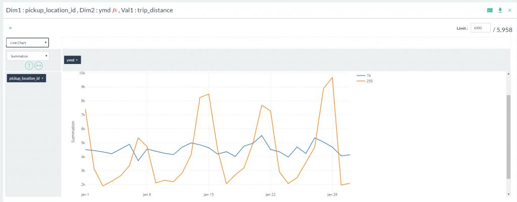
Notice that 74 has a much more consistent and narrow range for distance, while 255 has a much wider range. The large peaks for 255 are attributed to weekend pick ups.
Once the sample data has been loaded, you can begin interacting and analyzing the data from the Report UI. From here, you can sort, filter, add columns and create pivot tables. The following steps goes through a basic exercise to show how to analyze the New York taxi sample data.
Adding your own data
If you want to analyze your own data with Pivot Billions Docker version, you can do so by following these steps. Please note that the docker versions performance is highly contingent on the hardware and software specifications of your PC.
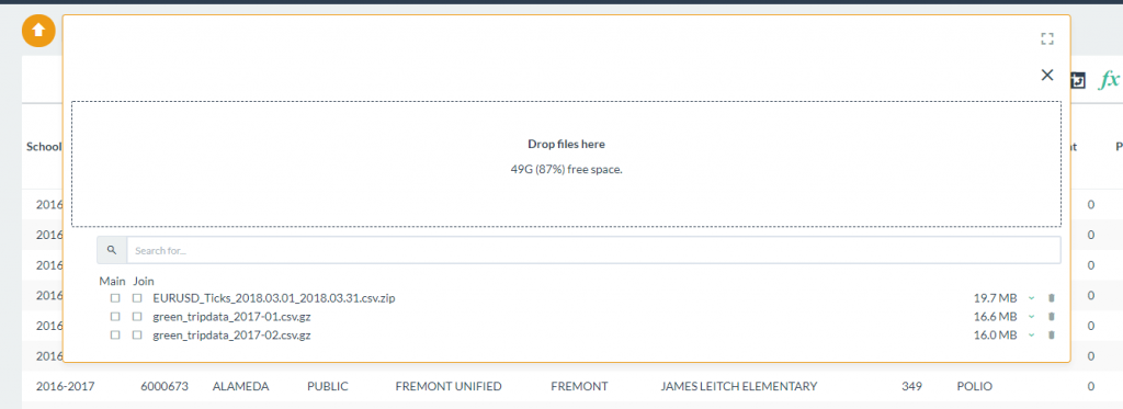
- Click on the plus symbol located in the upper right of the the data selection box to show data import options.

- The Drag & drop option lets you add files stored locally on your PC.
The From URL option lets you specify files accessible online by entering one or more URLs into an input box.
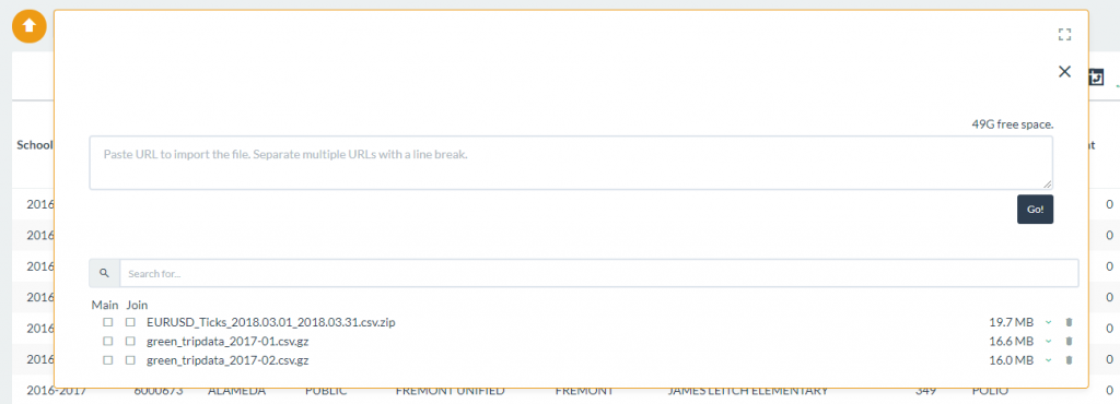
- After you've added your new data files either from local storage or from an online source, you will see the new data files in the data selection box.

- Select your newly added files and select the Preview button to view the column labels and data types.
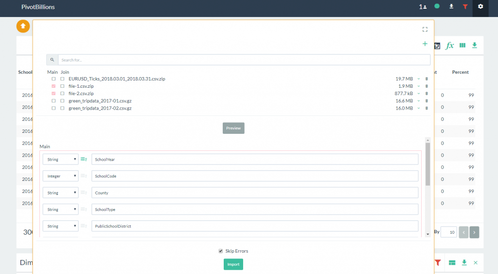
- Make any changes to the column labels and data types and then select the Import button when you are ready. You should see your data loaded in the report table.
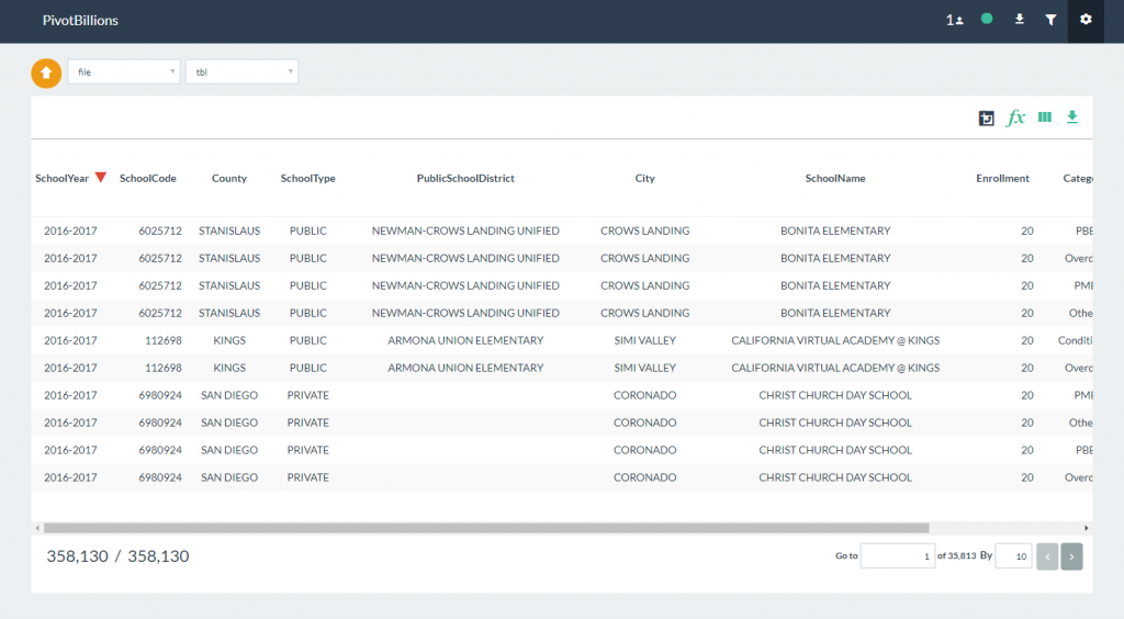
- Once the report table displays, you can interact with it and begin analyzing.
Combining multiple files
Often times, the data you want to analyze might be split over multiple files. In order to analyze all the data as a cohesive data set, you must first combine the files. In Pivot Billions, you can combine data files that have the same schema or data structure by following these steps.
- From the data selection box, click on the check boxes for each file you want to combine under the Main heading. In this case we are using the two New York taxi data files already included with Pivot Billions.

- Select the Preview button to view the column labels and data types and click Import when you are ready.
- The combined data files will be loaded into the report table. Notice that the combined row count is twice that of a single data file.
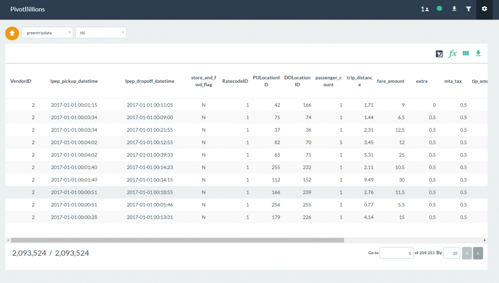
- You can combine as many files as necessary, but please keep in mind that capacity and performance are dependent on your docker system resource settings. For larger data sets, it may require that you allocate more memory and/or cpu to process efficiently.
Joining files
When you have different types of data files that are connected through common keys, Pivot Billions allows you to Join these files in a left join fashion. This is very useful if you want to integrate a lookup table to your primary data set. In the following example, we will combine the two sample New York taxi data files and then join the taxi zone lookup table file located here to the combined data set.
To Join data, follow these steps:
- Import the taxi zone lookup file by entering the URL in the data selection box. Click on the Go button to import the file.
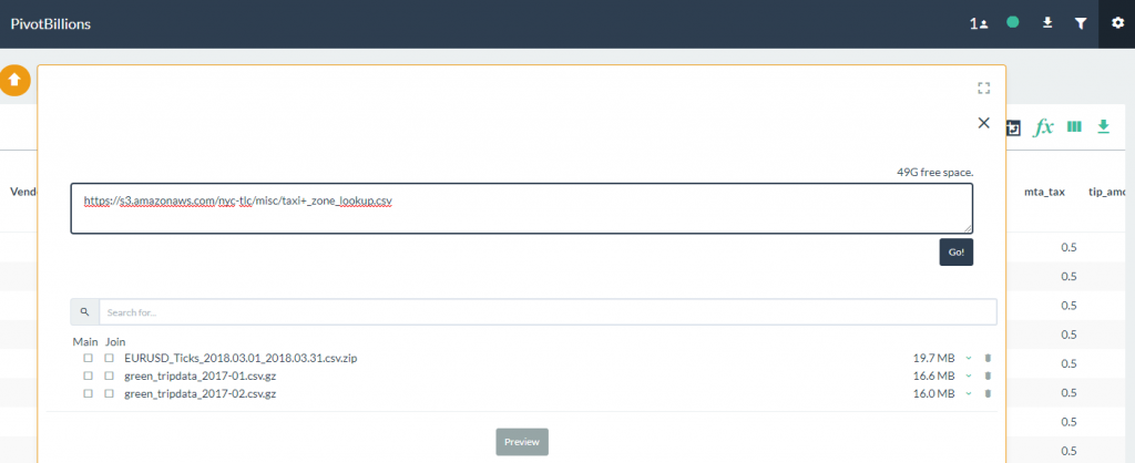
- Once the lookup file has loaded, click on the check boxes under the Main heading for the taxi data as shown, and then click on the check box under the Join heading for the taxi zone lookup file you just loaded.

- Select the Preview button to view the column labels and data types. Notice that there is a warning message above the schema preview that indicates there is no matching key column between the Main data set and the Join file. In the Main data set, there is a column labeled PULocationID while in the Join data set there is a column labeled LocationID.
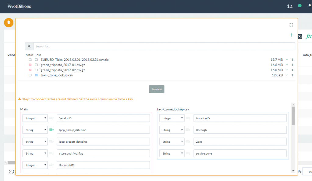
- Change the LocationID label in the Join data set to PULocationID as shown. Notice that the warning message disappears after a matching Key column has been identified.
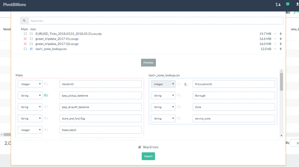
- Click on the Import button to load both the Main data set and the Join data set. Once it has loaded into the report table, slide right until you see the newly joined data columns of Borough, Zone and service_zone.
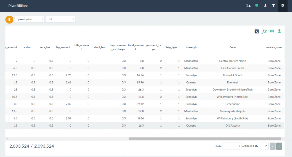
- At this point you can now select these columns as dimensions for analysis in pivot tables, as well as perform all other report functions. In this example we demonstrated joining one lookup table file, but you can Join multiple files as necessary following the same steps.
